Pie Properties

Design a Real Estate Crowdfunding Platform that Revolutionizes Single-family Real Estate Investing
    Team
    2 UI/UX designers, 1 Product manager,  and a Team of Front-end Developers
    Timeline
    April- June. 2023
      Deliverables
      Research Insights, Wireframes, interactive prototypes, Branding elements
      Background
      While AlphaX Re Capital expanded its business and turned into a fintech company from a traditional asset management company 🏠, it would like to attract more investors to invest in its real estate funds. Recognizing the absence of a website to engage with potential investors, they invite our UX team to create the fundraising platform, Pie Properties 🍰, for investors to understand how the funds work and easily make transactions💰.
      Contribution
      I was part of the design team to make Pie Properties’ website from 0 to 1. I led the UX work and collaborated with cross-functional teams, producing all major deliverables and presenting these to the client in weekly meetings 🖥️.

      The Business Goal

      The client's objective is to create a platform that attracts and encourages investors to make investments efficiently 💰.

      The Design Challenge

      However, the requirements of the business may not always align with those of the users 🤔. Achieving business needs through user-centered design is a fundamental principle of UX design⚜️. Satisfied and engaged users are more likely to convert, remain loyal, and contribute to a business's long-term success, making it a win-win 🎉 for both users and the business.

      As a result, I initiated our first internal kick-off meeting and reframed the design challenge using a "How Might We" statement:


      How Might We Design a platform that empowers investors (users) with the information and tools they need to make informed investment decisions, while optimizing the user journey for higher conversion rates?

      Solutions Overview

      On the Homepage

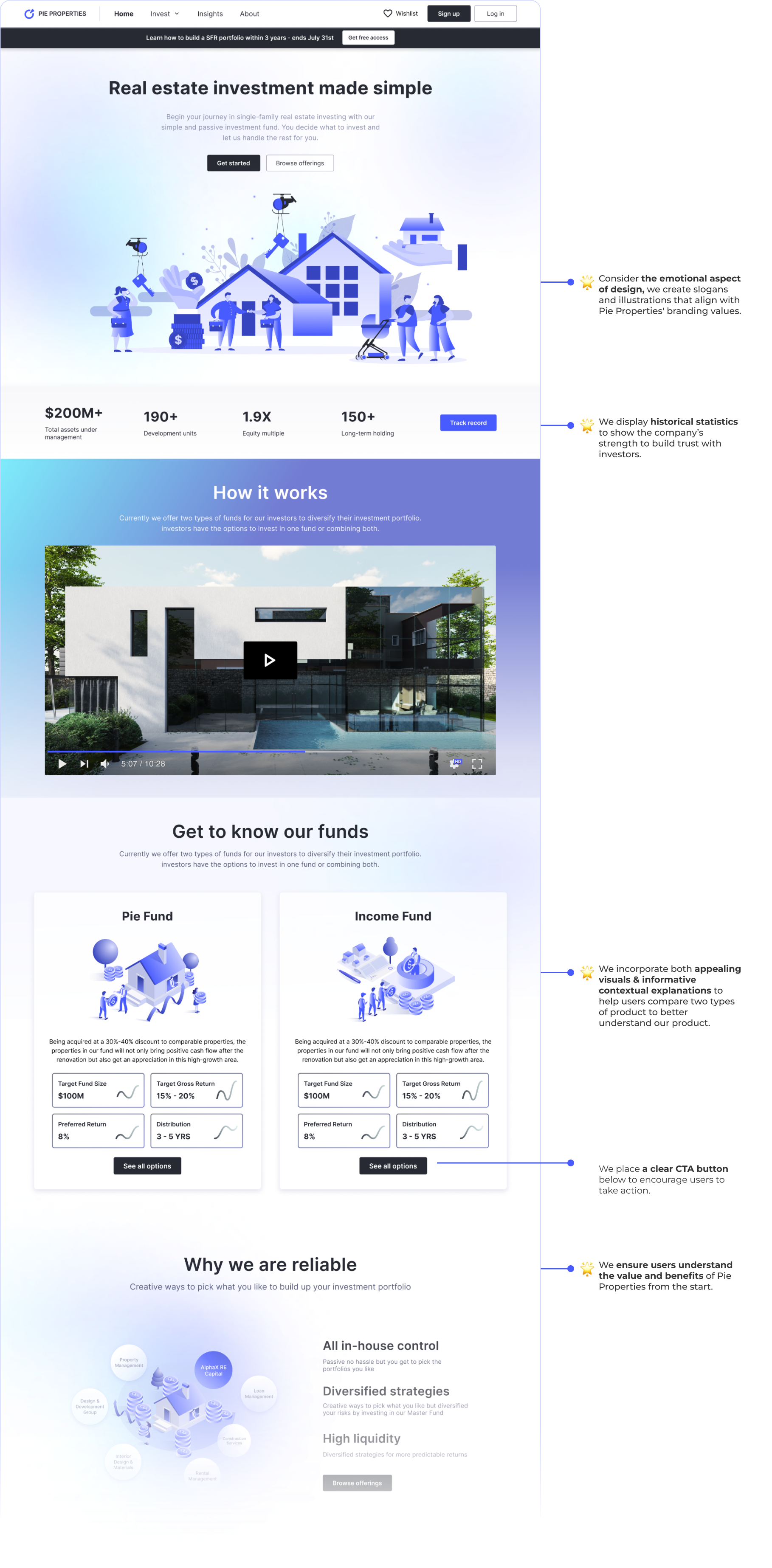
      Ensure users understand the value and benefits of Pie Properties from the start

      Enhance the onboarding process by providing clear and concise information about Pie Properties’ values, how the platform works, and investment options.
      On the Fund Detail Page

      Educate novice investors on funds and investment returns to help them make informed decisions

      Well-informed users are more likely to convert into actual investors. When novice users understand the potential benefits and risks of real estate investments, they are more likely to take that next step.
      On Personal Portal Page

      Engage potential investors to track collected portfolios, and get customized help

      The personal portal includes a watchlist feature that encourages users to engage with the platform regularly as they return to check updates on their tracked properties and events.
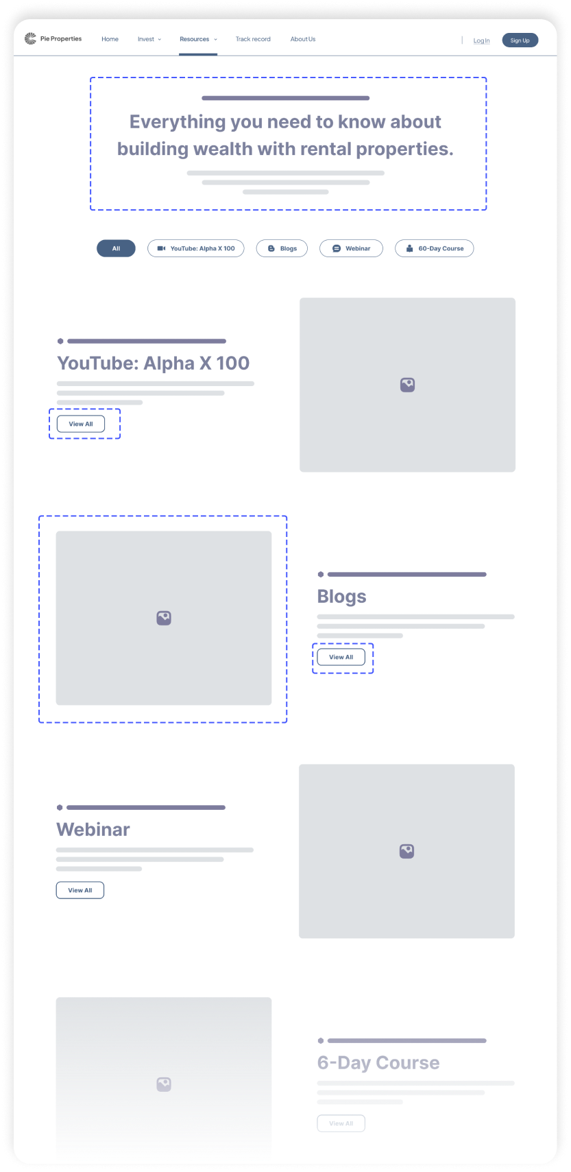
      On the Insight Page

      Build trust in a long-term through receiving industry insights and educational resources

      Offer educational resources to demonstrate Pie Properties's commitment to helping users succeed. This can build trust and credibility, which are crucial for attracting and retaining investors.
      How we get there

      Design Process

      Research

      The project's primary purpose is to create a platform that encourages the investment process for investors (users) to boost the conversion rate for Pie Properties (clients).

      Our design team had zero knowledge 🤯 about Real Estate Investing 🏡 at that time, so I led our group by starting the project with various questions💭.

      To understand the questions above, we started research to better understand the problem space as well as our users.

      We did a comprehensive competitive analysis on 6 competitors, read through 8 research reports 📖 and product docs 📋, and did 6 meetings with internal stakeholders 🙌 to learn the Real Estate Investment domain and understand Investors’ needs.

      What have worked well in the market?

      Competitive Analysis

      We identified some valuable features that our competitors are using to build trust with investors and simplify the investment decision-making process, like Display Track Records, Learning Resources, Consultation Entry, Trust Verification, Return Calculator...
      Who are our users? and What their needs and goals ?

      Stakerholder Interview & Persona

      We scheduled 6 sessions with internal stakeholders and potential users to gather key information to help us understand their needs and goals for investing real estate funds. Findings and insights are concluded in the below Persona.
      How do users invest & What are the pain points for the current user experience?

      User Journey map

      We also ask questions like ❓ "What do you feel uncomfortable about the current investing process", and ❓ "Where can be improved".
      Based on that, we mapped out the user journey and pinpointed steps where users might encounter difficulties or frustrations. After confirming with the clients, we conclude them into four primary pain points with corresponding solutions.
      Why do users hesitant to invest?
      How to improve?

      #1:  Ambiguity in highlighting efforts and explaining the investing process

      Novice Users don’t know Pie Properties' values and benefits, and they also unclear 😵💫 about the steps they need to take to make investments, and they didn’t get enough information about how funds work and how to get returns 💰.
      👉

      Understandable & Actionable

      🌟 Enhance the onboarding process about how the funds work, listing of selectable properties, and expected returns to ensure users understand the value of Pie Properties from the start.
      🌟 Display track record to highlight successful investments, historical returns, and case studies to instill confidence in potential investors.

      #2: Scarce terminology explanations & Insufficient transparency

      Novice users who lack domain knowledge 🤯 about real estate investing may find it challenging to comprehend terminologies and how to invest 📚 without clear explanations.
      👉

      Instructive & Well-Infomative

      🌟 Create interactive tools like an ROI calculator that allows users to estimate potential returns on their investments, and incorporate factors like property appreciation and expenses to make it user-friendly and transparent.
      🌟 Use infographics to simplify complex concepts or data, making it easier for users to understand key information and help them make informed decisions.

      #3: Dead end toward consultation and further investments

      Users may find it frustrating 😠 when attempting to access consultation services or tracking intended investments.
      👉

      Supportive & Personal

      🌟 Offer responsive customer support where users can reach out for clarification and guidance when encountering unfamiliar terms or concepts.
      🌟 Provide watchlist to engage potential investors to return and track collected portfolios, so extend to additional investments.

      #4:  Lose connection and trust with Pie Properties

      When returning users no longer receive adequate post-investment services or additional investment opportunities🏠, they feel loss of confidence🙁 in the company’s services and reliability.
      👉

      Convincing & Helpful

      🌟 Integrate educational resources on real estate investing, such as guides, articles, videos, and webinars to demonstrate Pie Properties's commitment to helping users succeed, which helps build long-term trust with investors.
      🌟 Provide recommendations with market trends to engage users to explore investment opportunities and take action.

      Ideate

      Following the 4 design principles and multiple design opportunities 🌟, we created user flows and mocks from wireframes to high fidelity.

      Provide values, Build trust, Engage investment and Improve the conversion rate

      Information Architecture

      Wireframes to Hi-Fi Prototypes

      Provide multiple design options & Iterate based user feedback

      This is a highly iterative process 🔁 . We also did a testing with a clickable prototype. With feedback from users👨 as well as stakeholders🧑, we tried to identify design solutions and detailed features to provide a seamless experience for investors.
      Major Iteration #1:
      To create an understandable and informative
      Fund Detail Page

      🧑 PM's Feedback:

      “We want to display all information including fund details in this page though that will be very long, because we think it important to keep the information transparency.”

      🙁 User’s Feedback:

      “This page is really long. When I scroll down, it's just way too much information, and I kind of get lost in it.”

      🌟 Conflict with PMs

      We agreed with the PM that information transparency is important for investors, but users may feel cluttered and difficult to navigate with an overwhelming webpage.

      ⬆️ We designed a navigation bar to highlight desired content and improve the search efficiency.

      ⬆️ We incorporated hover interactions into the property cards to conserve page space effectively.
      wireframe
      Before
      After

      🧑PM's Feedback:

      “We want to include as many CTA buttons as possible in this page to encourage and increase user sign-up actions.”

      🌟 Conflict With PMs

      We understand PM’s requirement that proper CTA buttons could improve the conversion rate, but users may be overwhelmed by too many and choose not to engage with any of the CTAs.

      ⬆️ We've strategically placed CTAs with user flow in mind. For example, in addition to the initial "sign-up" action, we've provided an additional CTA that allows large-dollar investors to schedule a meeting with the company. This ensures a seamless and tailored experience for our users.

      ⬆️ We've included an"invest" button for the ROI calculator when users encounter high returns from the fund. This approach ensures that CTAs are contextually relevant and encourage user actions at the right moments.
      wireframe
      Before
      After

      🧑 PM's Feedback:

      “We like the ROI calculator and want to keep its professional with annual gross return prediction.”

      🌟 Improvements

      While it is important to keep professionalism, PM may not realize the knowledge gap that users may not understand some keywords.

      ⬆️ We found users prioritize the current return on their investment, so we visually emphasize this aspect and continually iterate to engage users in generating their returns.

      ⬆️ We made the calculator collapsible, so investors can still click to see more professional analysis with explanatory tooltips.
      wireframe
      Before
      After
      Major Iteration #2:
      To create an attractive and pervasive Homepage

      🧑 Clients' Feedback:

      “We want to present our brand's characteristics on the homepage and let them know our benefits from the start.”

      🙁 User’s Feedback:

      “The terminology is difficult to read, and the presentation can’t engage me to read furtherly.”

      🌟 Improvements

      The initial version loses the information clarification and engaging storytelling to attract investors. Considering the emotional aspect of design, we create slogans and illustrations that align with Pie Properties' branding values.

      ⬆️ Think about the proximity principle, we strategically position the CTAs near related content, making it easily accessible for users to access further details.

      ⬆️ We incorporate both appealing visuals and informative contextual explanations, as users tend to perceive aesthetically pleasing designs as more friendly.
      wireframe
      Before
      After
      Major Iteration #3:
      To create an attractive and pervasive Insight Page

      🧑 Clients' Feedback:

      “There are substantial amount of blog content and only one upcoming webinar. It may not be necessary to create a separate individual page for the webinar.”

      🙁 User’s Feedback:

      “I find it troublesome that I have to navigate to another page to browse more information.”

      🌟 Improvements

      ⬆️ Due to the variety of content, we break down each part of the content and improve the overall browsing experience by organizing all of them into filterable categories.

      ⬆️ We design various visual aids and layouts for webinars, courses, and blogs to present necessary information that users need to know in a more vivid way.
      wireframe
      Before
      After
      Major Iteration #1:
      To create an understandable and informative Fund Detail Page
      WIREFRAMS
      wireframe

      🧑 Clients’ and Users’ feedback:

      “The navigation on long pages is good for quick access, but it is too long to see all.”
      Boost user’s sign-up action can improve conversion rate, but I may want more advice before investing.”
      “I like the ROI calculator, but it may be still hard to understand though there are explanatory tooltips.”
      Clear access to detailed information about individual properties is necessary, but the property list takes too much space.”
      “The map view feature allows me to explore investment opportunities based on location, but the serial number of property in the map doesn’t make sense.”
      MID-Fi
      wireframe

      🌟 Improvements

      Restructure the content by relocating the navigation bar to a distinct heading section, separate from the body section
      Offer more entry points for users to request consultations and use engaging language to increase the likelihood of conversions
      Simplify the calculator by making it collapsible, but highlight the most important information: the Return.
      Reorganize the information hierarchy and add the hover interaction to save space
      Replace the serial number with classifications which is more meaningful info for users.
      Major Iteration #2:
      To create an attractive and pervasive Homepage
      WIREFRAMS
      wireframe

      🧑 Clients’ and Users’ feedback:

      “We want to incorporate more visual elements that present our brand's characteristics.
      “The video is important to introduce how our product works.
      “The data which shows successful investments is attractive, but how can I access further details?”
      “The terminology is difficult to read, and the presentation can’t engage users to read.”
      MID-Fi
      wireframe

      🌟 Improvements

      Consider the emotional aspect of design, we create slogans and illustrations that align with Pie Properties' branding values
      Reconsider the information hierarchy and place greater emphasis on the introductory video.
      Think about the proximity principle, we strategically position the "Track Record" button nearby, making it easily accessible for users to access further details
      We incorporate both appealing visuals and informative contextual explanations, as users tend to perceive aesthetically pleasing designs as more usable. We also place a clear CTA button below to encourage users to take action.
      Major Iteration #3:
      To create an organized and user-friendly Insight Page
      WIREFRAMS
      wireframe

      🧑 Clients’ and Users’ feedback:

      “The top intro does well in letting me know the purpose of the page, but because our YouTube videos are very popular, can we put more emphasis on it? ”
      “We have a substantial amount of blog content and only one upcoming webinar. It may not be necessary to create a separate individual page for the webinar”
      “I find it troublesome that I have to navigate to another page to browse more information.”
      “The webinar is only provided for registered investors.”
      MID-Fi
      wireframe

      🌟 Improvements

      Add educational recommendations on the banner instead of a slogan to pique the interest of visitors, encouraging them to explore the website further.
      Due to the variety of content, we break down each part of content and improve the overall browsing experience by organizing all of them into filterable categories.
      We design various visual aids for webinars, courses, and blogs to present necessary information that users need to know in a more vivid way.
      By offering several portals, the website provides multiple conversion paths for users to take, accommodating different entry points and customer journeys.

      In addition to numerous iterations 🔁 on functionalities, interactive elements, and written content...
      We also put effort into enhancing visual elements✨, as aesthetically pleasing designs play a significant role in conveying messages✨, reinforcing branding✨ and engaging users to learn or continue browsing✨.

      High-fi Prototypes

      After 10 weeks of iteration, we successfully handed the Hi-fi prototypes with click through to the Pie Properties' developers 🎉. Scroll to see the final design below.

      Impact

      Collaborating with Clients
      💁Throughout this project, I encountered several instances where the PM and I held differing opinions. For instance, the PM wanted to add entry points on the page to improve conversion rate, but this compromised user-friendliness. After discussions, we kept one entry point and plan to conduct usability tests to better balance business needs and user experience. In the future, I will prioritize user-friendly products while working closely with PMs to meet business requirements.

      Takeaways

      The feedback from clients was really positive😊, indicating that they feel the final design could better help them with their marketing experience and conversion rate.

      I collaborated closely with developers🧑💻 from Pie Properties during the implementation phase, providing guidance and clarification on design elements, interactions, and user flows to ensure that the design is accurately translated into a functional product.

      At present, Pie Properties has launched the website and put it into active use 🎉. Additionally, user testing and optimization efforts are continuing to ⬆️ enhance user engagement and satisfaction.

      👀 Discover More of My Work
      Empowering Novice Admins to Set Up Robots Knowledgeably & Efficiently
      UX Design & Research  | Robotics  |  B2B  |  Product Education
      Digital Analytics to Refine the ACTA's Digital Strategy

      Dashboard  |  SEO Audit | Social Media Analytics
      Enhancing Brand Consistency & Accessibility For Aetna’s website
      UI Design  |  HealthCare  |  B2C  |   Desktop