

Our users have expressed difficulty in finding information. We have two immediate priorities at this stage:
(1) Making the site user friendly
(2) Reorganizing content to make it immediately clear that it serves multiple audiences (scholarly and general public, including educators).

After receiving the general requirements from the site creators, Dr. Dawn and Joseph Hayes, we decided to focus the scope of the study on gaining insights into how users navigate the website as well as find and understand information about the history and culture of Norman Sicily. A great way to find insights into this problem is to conduct moderated usability testing of the site. We chose to test three key features — the image server, the people page, and the place page, focusing on scholars, educators, and the general public with a general interest in learning the history and culture of Norman Sicily.


We designed scenarios and user tasks and employed the Pre & Post test questionnaire for each user test session. This allowed us to gain deeper understanding through combining both qualitative and quantitative information and recommend valuable changes.
Screening Questionnaire: To learn about the participant's demographics, jobs and their interest in the Norman Sicily Project.
Scenarios & User Tasks: To gain insights on how users go about using the website to complete certain tasks.
Pre & Post test questionnaire: To learn about the overall usability and the impression of website before and after users did the tasks.
We sent the screening questionnaire to recruit potential target audiences (scholars, educators, and the general public). For participants who filled out the screening questionnaire with their email addresses, We sent Calendly links for the invitation and scheduled interviews.

Based on the responses of the screening questionnaire, 8 prospective candidates were shortlisted for the study; 2 were researchers and 6 were students whose major is related to history and highly interested in Sicily history and culture.

I did the moderated user test with two participants. After completing the pre-test questionnaire, each participant was given three tasks regarding the three different focus pages (Image Server, Place, and People page) and was asked to “think aloud” their thought process while performing the three tasks. Each session ended with a post-test questionnaire, asking the users to reflect on the usability and impression of the website.
With moderated tests have the evaluator in the session along with the participant and can work to prevent or correct set-up errors. Additionally, we adopted a communicative moderator style to provide verbal feedback to keep participants talking and asking additional questions during the test session.
Based on our conversation with the client, we prepared the following scenario and tasks to test the different features of the website. Each test costs 30 min.
“Imagine you are writing a research paper about Norman Sicily. You want to gain a deeper understanding of the Monasteries of Norman Sicily and their Greater Network, as well as the Norman Rulers of Sicily and their Family Networks from the website: http://normansicily.org/en/home/ .”
Task 1: You wish to know the name of the Mother and the Children of King Roger I of Hauteville.
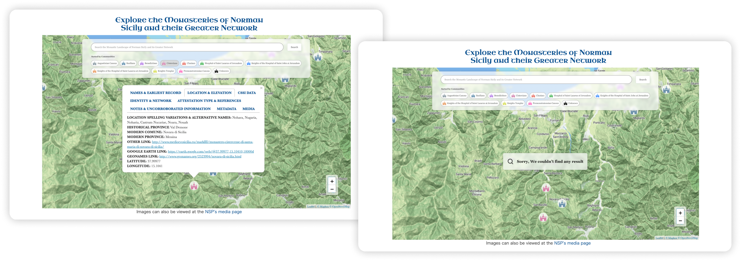
Task 2: You are searching for Saint Mary of Novara, a medieval church that was acquired by the Benedictine community. Your goal is to obtain the precise latitude and longitude coordinates of the church's location.
Task 3: Imagine you are interested in pictures of Churches around Sicily and want to download a photo of a specific one called “Chiesa Bizantina” for your research. Please show me how you would go about this.
After completing each test session, evaluators documented observations and findings on the spreadsheet below to consolidate the insights. We then analyzed the user behaviors/reactions that were observed frequently to draw out the usability problems. The following rainbow spreadsheet of total usability issues found across all participants. This data was already familiar to everyone in the group because we all sat in on every session.
We then prioritized and identified the most critical issues and attempted to provide recommendations that address these issues effectively.

Based on this feedback, we identified the most important areas that require attention. These include the graph describing the greater family of the kings of Sicily, the map providing information on Monasteries of Norman Sicily, the accessibility of the image server link, and the readability and usability of information on the homepage.
To address these issues, we analyzed and merged smaller issues that were related to each task.Our presented recommendations aim to provide practical solutions to the issues encountered during the user testing, thus enhancing the overall usability and user experience of the website. The top four recommendations are expanded upon below:
“User testing reveals usability issues with the "People" page interactive map due to clutter and lack of interactivity, leading to difficulty finding information and understanding the legend.”

“Optimizing Graph Navigation and Search with Improved Layout and Interactivity.”
To increase visibility, the search bar should be placed at the top of the page instead of integrating it with the legend. Additionally, We have redesigned the Legend for better visibility. We have also added legend connections as filters to enhance the search's specificity, allowing users to select specific data they want to find.
In addition, when a user selects a particular node from the graph to view the family network of a specific king, the node will remain active even if the user moves the cursor. The selection of the node will grey out all other nodes that are not related, resulting in better visibility of the selected family network. Lastly, when certain nodes are dragged, the graph will actively connect to a specific Norman ruler and family network. With these modifications, users will be able to effectively and efficiently search the network for specific Norman rulers and family members.

“Participants faced challenges with the search function on the "Place" page of the website, including unclear search results, no visible search button, overlapping tabs, and a lack of a legend for the colorful icons on the map”

“Increase the discoverability of the call to action (CTA) of the searching button and the legend by placing them in a more prominent place.”
“Improve the visibility of system status by providing immediate and informative feedback on users’ search actions to help users to feel in control and understand what is happening.
Adding a visible search button next to the search bar to make it clear to users that they need to click the button to initiate the search.Additionally, we suggest prioritizing the position of the legend, which displays the meaning of the symbols with textual explanations so that users can understand the symbols before they start their search. Integrating the legend into the search function as a filter could also improve search efficiency. Using filters, users can refine their search results by selecting specific criteria, making it easier to find what they seek.

To provide more precise feedback for each search action, we recommend displaying the search results in an informative tab below the search area immediately after users enter a keyword. In cases where no relevant results are found; we suggest using a temporary pop-up window to display a clear message indicating that no search results were found. This will help users better understand their search results and reduce confusion.
“Usability issue with Norman Sicily website's Image Server Link affecting user access to images”
During our user testing session, we observed that all participants went to the Resource page (See figure L) after seeing Task 3, expecting to find images or a way to access them on that page.

“Add an access point to the image database on the Resource page with clear labels and improved hover state.”
During our user testing session, we observed that all participants went to the Resource page after seeing Task 3, expecting to find images or a way to access them on that page. To improve the user experience, we have added a subtitle underneath the title on the Resource page to give users context about what they can find there. We have also added sub-labels for all four options on the page, giving users an idea of what to expect from each option before clicking on it. For eg. One of the options is labeled "Gallery", where users can access images and explore the database efficiently.

“Improvements needed for usability, cluttered with text, difficulty finding image server, information lacks categorization”
Half of the participants felt that the homepage was too cluttered with excessive text, and some participants had difficulty locating the image server during task 3. It appeared that they did not thoroughly review the homepage content, as they assumed there was no image server available. Additionally, certain information on the homepage lacked clear categorization, making it hard to find and access.

“Simplify and reorganize text, add navigation options, and include more images”
First, simplify the text on the page, use headings and subheadings to categorize information, and make it more readable. Second, add navigation options to make it easy for users to move between sections. Third, include more images to create a visually appealing design that enhances the project's objectives.

Our recommendations were well-received by the client. They were surprised that since they had been using the website for so long, even though they had come across these usability issues, they did not see them as an issue for the users. They liked the fact that some of the recommendations were easy fixes like the search button and including more images, that could be implemented quickly.
The entire evaluation process was very well planned and executed by the team. It was a great experience working with such a well-coordinated team.
Our collaboration with the clients has been successful and enjoyable overall, but we encountered a minor issue. We contacted some individuals who were listed on the "Credit" section of the Norman Sicily Project's website to invite them to participate in our user testing study, as one of our user profiles is for academic professionals and researchers. However, the client expressed discomfort with our outreach approach and raised concerns about how the board members might feel. After seeking advice from a professor, we explained our intentions to the client and acknowledged that it was an honest mistake.
This experience taught us that board relationships are sensitive and clients can react strongly to them, emphasizing the importance of being mindful of their sensitivities in the future.